Loading...

Understanding Bar Graphs and Pie Charts

Video Lesson on Understanding Bar Graphs and Pie Charts

Understanding Bar Graphs and Pie Charts

In this lesson, we will examine two of the most widely used types of graphs: bar graphs and pie charts. These two graphs can provide the reader with a comparison of the different data that is displayed.

Understanding Bar Graphs & Pie Charts

One of the more fascinating ways to record data is to put the data in a graph. Two of the more popular graphs are bar graphs and pie graphs. In this lesson, we will examine how to read and interpret the information that can be found on these graphs.

Bar Graphs

A bar graph is a graph that can be used to compare the amounts or frequency of occurrence of different types of data. Bar graphs are helpful when comparing groups of data and comparing data quickly. Let's look at the important parts of a bar graph.

All bar graphs have a graph title, which gives the reader a brief overview of the type of data that the graph contains. The graph title in this graph is 'Percentage of U.S. Population That Is Foreign-Born.'

16 -73948128

Percentage of the U.S Population That Is Foreign-Born

Bar graphs also contain two axes that are labeled and also have a scale. The axis that is labeled at the bottom of the bars is referred to as the group data axis. This axis details information about the type of data that is displayed. The other axis in a bar graph is called the frequency data axis. This axis has a range of values that measures the frequency that the data occurs.

The most important part of a bar graph is the bars. These bars provide an instant comparison of data in a graph. The reader can easily compare the data to see which measure occurs the most often and if any data points have similar frequencies.

17 -43149592

Let's look at a different bar graph to sharpen our skills on labeling its parts. Looking at this new graph, there is one obvious difference. This bar graph is going horizontal instead of vertical like the first example. The title of this graph is 'Sports Shoes Sales' and is located at the top of our graph. The group data axis is located along the left side, which is directly under the bars. The title of the axis is 'Types of shoes.' The frequency data axis is located at the bottom of the graph and is labeled 'Average cost.' The bars of this graph are running horizontally.

Reading a Bar Graph

When reading a bar graph, it's important to pay attention to the intervals used on the frequency data axis. An interval is the amount of data that occurs between each section or tick mark.

Looking at the graph 'Sports Shoes Sales,' we can see that the frequency data axis is located at the bottom of the graph. Along this axis, we can see each tick mark represents $10. That is important, because there is data between each of these tick marks. Data located between two marks is often estimated to the closest value. For example, look at the bar for 'Gym Shoes.' The bar for 'Gym Shoes' ends between the $20 and $30 marks. The bar appears to be more than halfway between these two points, so a good estimate would be either $26 or $27. To read a bar graph, find the point where each bar would meet the frequency data axis.

18 -18510966

Favorite Syndicated Programs Bar Graph

Let's look at the 'Favorite Syndicated Programs, 1999 - 2000.' This graph is also displayed horizontally, so the frequency data axis is located at the bottom of the graph.

Which program had almost nine percent of TV households viewing? The answer is Jeopardy. Looking at the Jeopardy bar, it is slightly more than nine percent, so a good estimate would be about 9.5%.

Which program had the least percentage of TV households viewing? The answer is The Jerry Springer Show. The Jerry Springer Show had the shortest bar and lies between three percent and six percent. A good estimate would be 4.5%.

Approximately what percent of TV-viewing households watched Friends? Friends had slightly more than six percent of viewers. A good estimate for this would be 6.2% of viewers.

Pie Charts

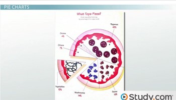
Shifting gears slightly, let's look at another popular type of graph used to display and compare data. Pie charts(also referred to as a circle graph) are circular graphs used to show the relationship of a part to a whole. A pie chart displays its data in sectors, which are parts of the circle and are proportional to the other parts displayed in the graph. Pie chart values are represented by percentages, with each chart representing 100%. Let's examine a pie chart and identify the important parts.

19 -23918682

Looking at this pie chart, the first important part is the graph title. The graph that we are looking at is titled 'What Tops Pizza.' It compares the most popular pizza toppings in relationship to one another. The title and the creative picture used for the pie chart give the reader information about the type of data displayed in the chart. Another important part of this pie chart is the sectors. These sectors are different-sized areas that divide up the circle into proportional parts. This is such a tasty graph, let's now examine how to read the information that it displays.

Reading a Pie Chart

Each sector in a pie chart is labeled with the sector title and its numerical data. In this chart, each sector is labeled with its percentage. All pie charts represent a whole amount that equals 100%. If you were to add up the percentages of each sector, it would equal 100%. For example, let's look at the pizza pie chart. The percentages listed in each sector are 13%, 14%, 19%, 43%, four percent and seven percent. By adding all of these percentages together, 13% + 14% + 19% + 43% + 4% + 7% = 100%.

The size of each sector is also proportional to its percentage. For example, the largest sector is 'Pepperoni' at 43%. Since the 'Pepperoni' sector is the largest percentage, its sector is also the largest size.

Using the data in the pie chart, we can calculate other values. For example, there were 1000 people surveyed to create this chart. We can calculate the number of people who preferred each sector. In this pie chart, 14% of the people surveyed preferred mushrooms. To calculate the number of people who chose mushrooms in this survey, we would set up a proportion. The proportion would show x number of people out of 1000 chose mushrooms and 14% out of 100%.

To solve this equation we will cross-multiply. Multiply 100 * x = 100x and 14 * 1,000 = 14,000. So, 100x = 14,000. To solve this equation, divide by 100: 14,000 ÷ 100 = 140. There were 140 of 1,000 people surveyed who selected mushrooms.

Examples and Practice Problems

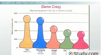
Now let's look at a few more examples of these two important types of graphs. Let's first look at a fascinating bar graph about the best-selling games in the U.S. titled 'Game Crazy.' Which game is the most popular game in U.S. history, and how many units have been sold? Looking at the graph, we can see that Uno has the tallest bar, meaning it is the most popular game. The bar for Uno is almost two million. A good estimate for the number of Uno games sold is 1.9 million.
20 -50166120

Which game has sold almost 1.3 million games? Looking at the bar on the left, 1.3 million would almost be between one million and 1.5 million. As I follow a line over between these two values, the Jenga bar appears to be closest to 1.3 million.

22 -95743488

The other type graph that we have talked about is a pie chart. Let's look at a pie chart that examines the earnings of college students beyond the classroom. The title of this pie chart is 'College Students' Earnings.' How many students of the 2,000 students that were surveyed have no job? To calculate this total, we will set up a proportion x students over 2,000 students surveyed equals 33% over 100%.

To solve this equation, we will cross-multiply. 100 * x= 100x and 33 * 2,000 = 66,000. So 100x = 66,000. To solve this equation, divide by 100: 66,000 ÷ 100 = 660. There were 660 students out of 2,000 surveyed who did not have a job.

Lesson Summary

Let's review these two types of graphs. Bar graphsare graphs that can be used to compare the amounts or frequency of occurrence of different types of data. To read a bar graph, find the spot on the frequency data axis where the bar would meet. A pie chart can also be called a circle graph. A pie chart is a circular graph used to show the relationship of a part to a whole. All of the sectors in a pie chart add together to equal 100%. The data in a pie chart can also be used to calculate other data.

Next Topic

Topics

Next Topic(s)

Current Menu

Random Topics

More for You
All in this Category

You may be interested in

Colleges in peshawar

A list of major colleges in Peshawa ...

Colleges in Multan

A comprehensive list of best colleg ...

Study in Germany

How you can get an opportunity to h ...

Making Millions

How to become a successful person i ...

St Michaels School - Karachi

St Michaels School - Karachi is pop ...

Dar E Arqam School Umar Campus

Dar E Arqam School Umar Campus is a ...

Schools in Anerley

Find a comprehensive list of major ...

Schools in Canvey Island

A comprehensive list of major schoo ...

Problem Solving

Lessons with practice question on m ...

Sentence Completion

Learn to crack Sentence Completion ...