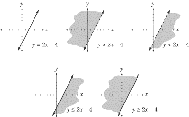
For this reason,
the graph of an inequality looks similar to the graph of a line but has two
major differences. First, the region on one side of the line (which side depends
on the inequality) is shaded. Second, the line itself is either dotted or solid
depending on whether the inequality is inclusive.

To summarize the above graphs: when the inequality is “greater than or equal to”
or “less than or equal to,” the line in the graph is solid; when the inequality
is “greater than” or “less than,” the line in the graph is dotted. Any point
that satisfies the inequality lies in the shaded region, and any point that does
not lies in the un-shaded region.
That’s all you need to know about graphing inequalities for the Subject Math .
Back
Next
Next to display next topic in the chapter.
Mathematics Practice Questions
Video Lessons and 10 Fully Explained Grand Tests
Large number of solved practice MCQ with explanations. Video Lessons and 10 Fully explained Grand/Full Tests.